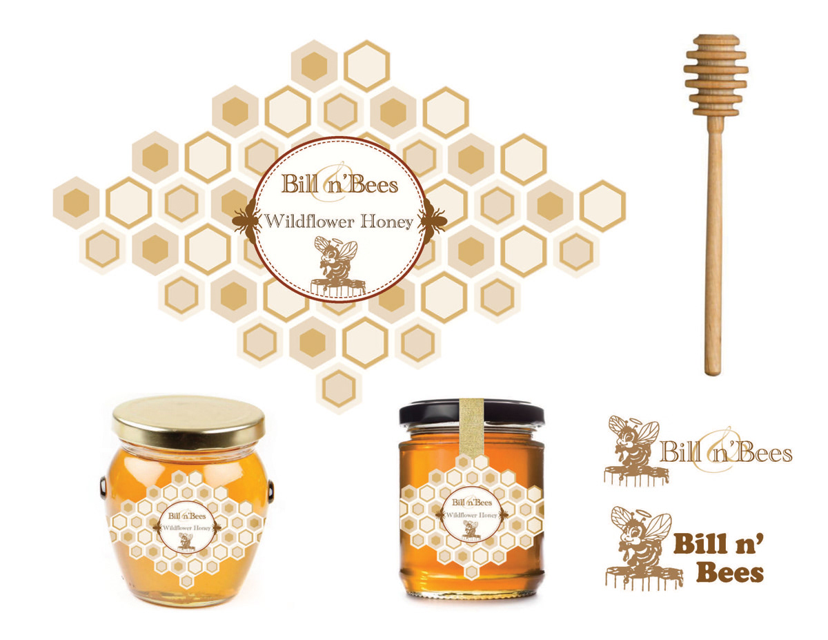
A successful beekeeper and businessman had expressed an interest in possibly looking at new designs for his bee products. The current design only included a logo. I wanted to create a suite of package designs that would capture his audience's attention and would convey the richness, luxury and quality of his products. For the color scheme, I chose natural colors similar to the multiple shades found in honey and the geometric pattern mirrored the cells where honey is stored. The main illustration from the original logo was kept but the type was updated to go more with the new look.